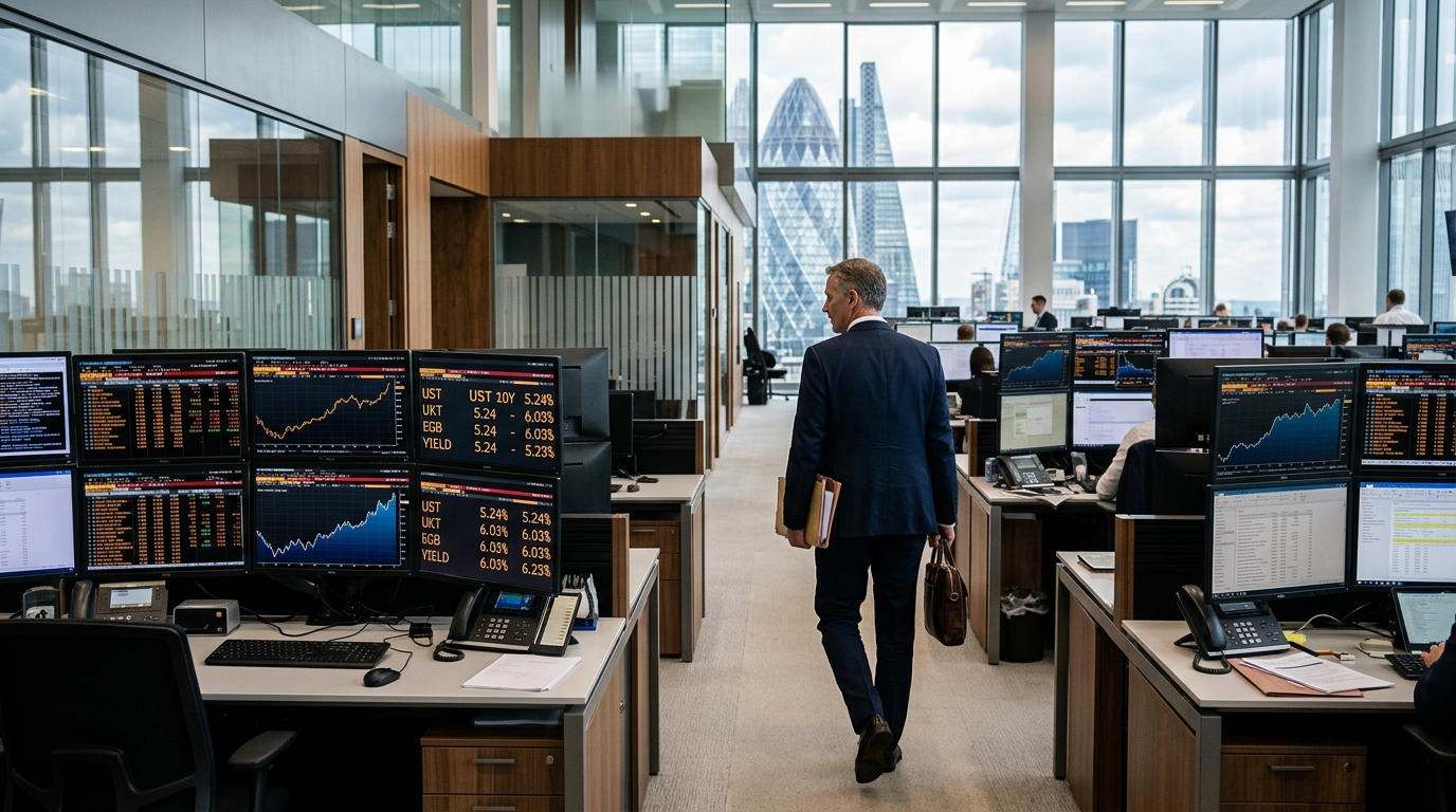

Thursday put investors in genuinely unusual territory. The 30-year Treasury bond yield hit 5.501%, a level not seen since June 2004. The 10-year surged more than 10 basis points to 5.223%, reaching levels not seen since June 2007. Those two dates are not random bookmarks. June 2004 was when the Fed began its last sustained tightening cycle. June 2007 was when that cycle ended, about 14 months before Lehman. The bond market has handed allocators a dated map rather than a loose analogy, and the debate now is whether the terrain has changed too much for the map to work.
Why Wall Street Cares
The Fed is not done. Last week the Fed unanimously raised the policy rate to 3.75% to 4.00%, and the dot plot showed 16 of 18 officials expect at least one more hike before year-end. New York Fed President John Williams said Thursday that another hike is a “reasonable” expectation, with investor sentiment suggesting “it’s likely that another rate hike may be appropriate by the end of the year.” The question professional allocators are asking is not whether more hikes are coming. It is what, exactly, history is telling them to do about it.
The Bull Case
BCA Research told clients this week that the Fed’s return to rate hikes is unlikely to derail U.S. stocks, pointing to history showing the S&P 500 has gained over every full tightening cycle since 1980. The 2004-06 episode is the cleanest analog. From 2004 to 2006, the S&P 500’s price-to-earnings ratio actually fell while the index gained 13%, profits simply grew faster than the discount rate rose. Goldman Sachs Research found the same pattern in a longer sweep: the S&P 500 averaged a 2% decline over three months at the start of seven hiking cycles, then a 9% gain over 12 months, with positive returns in every episode except 2022. Energy led in 2004-06 and appears to be leading again. The energy sector has been the top-performing S&P 500 sector in 2026, buoyed by the Middle East conflict and elevated oil prices. Financial companies tend to benefit from hiking cycles because their earnings often rise with interest rates.
The Bear Case
The 2004 analogy has a structural problem that did not exist when Greenspan was making his 17 consecutive quarter-point moves. BofA analysts noted that while long-end yields have “normalized” to pre-financial crisis levels, net outlays for interest are expected to equal 3.3% of GDP in 2026. When the 10-year was around 5% in 2007, net interest outlays were about 1.7% of GDP. The fiscal position is categorically different. So is the corporate sector. In the last 18 months, major hyperscalers moved from almost fully self-funded capex to raising external capital at scale, with incremental annual debt rising from 9% of capex in FY24 to 32% by mid-2026. The Big Four now guide to roughly $700 billion to $725 billion in combined capital expenditures in 2026, up roughly 60% to 77% from 2025. Roughly a third of that spending is now debt-funded at precisely the moment long-dated rates have hit two-decade highs.
What Investors Are Missing
The debate about whether the 2004 map applies has focused almost entirely on the equity level. The more important question is where within equities the 2004-06 playbook breaks down. In the prior cycle, energy’s strength was a demand-side story, a booming China consuming its way into every commodity. Today’s oil shock is supply-side, driven by Hormuz disruptions. The catalyst is a historic supply shock: the war effectively closed the Strait of Hormuz, cutting off around 20 million barrels a day of crude oil and refined products. Supply-shock energy rallies end differently from demand-driven ones, they compress rather than expand the consumer economy, which matters for the earnings growth that carried equities through 2004-06. Meanwhile, BCA warned that heavy AI spending adds rate risk, with that risk greatest for companies that rely on outside financing, carry high debt, or depend on profits far in the future. In 2004, none of the dominant equity sectors were funding themselves this way.
Stocks to Watch
XLE is the most direct 2004-map trade, but the exit matters. Structural risks include potential de-escalation in the Middle East and earnings growth that is forecast to turn negative in 2027. Supply-shock winners are tactical, not secular.
XLF has the clearest fundamental tailwind in a higher-for-longer world. Net interest margins expand as the curve steepens, and the sector is carrying far less credit risk than it was when the 10-year last traded here in 2007.
Gold is the honest hedge. From the pre-crisis market peak in October 2007 to the trough in March 2009, the S&P 500 fell about 57% while gold rose. If the 2007 endpoint matters as much as the 2004 starting point, gold’s role in a portfolio looks very different than a simple hiking-cycle framework suggests.